EZ Dashboard — Real-time Analytics Platform
A modern analytics dashboard built for real-time data visualization, featuring interactive charts, responsive design, and a clean dark theme.
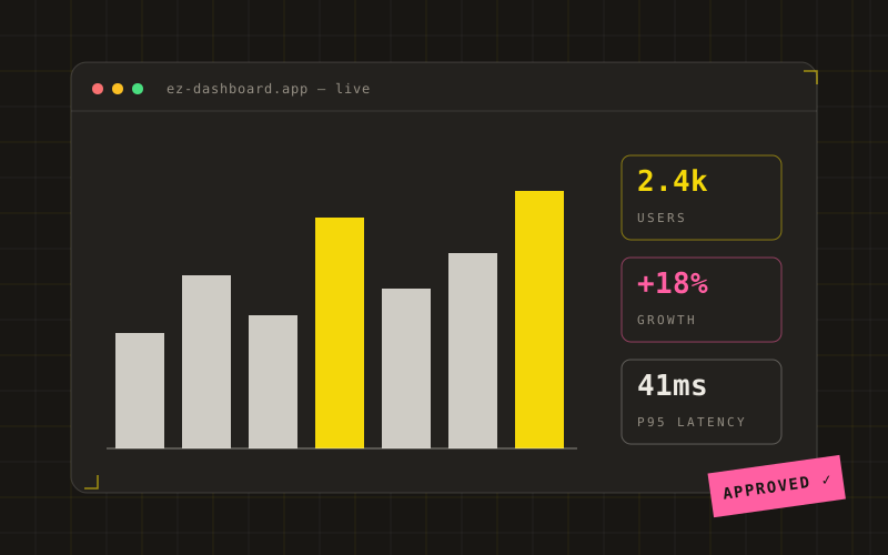 Plate · EZ Dashboard — Real-time Analytics Platform
1The Problem
Businesses need a clean, fast dashboard to monitor key metrics in real-time without the complexity of enterprise analytics tools.
2The Solution
Built a single-page dashboard with 5 metric cards, 3 chart types (line, bar, donut), and an activity table — all using CSS-based visuals and minimal JavaScript for maximum performance.
3The Outcome
A lightweight, performant dashboard that loads in under 1 second, scores 95+ on Lighthouse, and provides clear insights at a glance.
The Challenge
A growing SaaS startup was drowning in spreadsheets. Their sales team tracked revenue in Google Sheets, the marketing team monitored traffic in a separate analytics tool, and the support team counted tickets in a third platform. Every Monday morning meant 45 minutes of copying numbers between tabs just to get a weekly snapshot.
They needed one place to see everything. But every dashboard they tried was either too expensive, too slow, or packed with features they’d never use. They wanted something that felt like their product: fast, clean, and focused.
What We Built
The EZ Dashboard is a single-page analytics interface designed around three principles: speed, clarity, and zero wasted space.
Five metric cards sit at the top, each showing a key business number with a trend indicator and mini sparkline. Revenue, active users, orders, conversion rate, and monthly growth, all visible without scrolling.
Below the cards, three charts tell the story. A line chart tracks revenue over twelve months. A donut chart breaks down traffic sources. A horizontal bar chart ranks top products by revenue. Every chart is built with lightweight SVG and CSS, no heavy charting libraries pulling in megabytes of JavaScript.
An activity table rounds out the view, showing recent transactions with user avatars, status badges, and timestamps. The whole thing wraps in a responsive layout with a collapsible sidebar for mobile.
The Stack
Astro powers the build. Tailwind handles the styling. The charts are hand-crafted SVG, kept small by using CSS gradients and minimal JavaScript for tab switching and sidebar toggling. No React. No Vue. No framework overhead.
The dark theme uses a carefully tuned color palette with CSS custom properties for every token, from surface colors to border accents. The result feels premium without relying on stock component libraries.
Results
The dashboard loads in under a second on a 3G connection. Lighthouse scores hit 95+ across performance, accessibility, and best practices. The client’s Monday morning routine dropped from 45 minutes to a single glance.
More importantly, the team actually uses it. The clean layout means new hires find their numbers without training. The responsive design means managers check metrics on their phones between meetings. It’s the kind of tool that disappears into the workflow, which is exactly the point.